OVERVIEW:
LearnCoach aimed to redesign its desktop and mobile menu to enhance usability and create a more intuitive, seamless user experience. Insights from current users revealed that the existing menu could be improved for greater ease of use.
GOAL:
To design a new navigation system using the LearnCoach design system for consistency and ease of use across devices.
To design a new navigation system using the LearnCoach design system for consistency and ease of use across devices.
COMPANY:
LearnCoach - An online learning platform tailored for New Zealand high school students and teachers, offering resources to support the NCEA curriculum.
ROLE:
Lead Junior Product Designer - User research, ideation and visual design
User Research:
I began by evaluating LearnCoach's existing navigation to identify areas for improvement. This led to secondary research, where I analysed the navigation patterns of other websites, focusing on:
• Accessibility
• Consistency
• Visual cohesiveness.
By exploring these websites as a user, I asked, "Is this navigation seamless and intuitive?" I sought inspiration from designs that effectively utilised Hick's Law, simplifying decision-making and reducing interaction costs. This informed the redesign of LearnCoach’s navigation, ensuring it was easy to use, visually appealing, and required minimal effort to navigate.
The research helped me evaluate the LearnCoach navigation, pinpointing areas for improvement. I found the current design required multiple clicks to access pages, with unclear copy and no icons, leading to confusion and higher cognitive load. This analysis, alongside the research, highlighted key areas for a more intuitive redesign.
Research Analysis:
Based on the research, I focused on two main areas for the redesign: grouping pages within sections and improving visual cohesiveness.
Grouping:
Research showed that grouping pages within sections enhances user-friendliness, especially for platforms with many pages. This approach was essential for LearnCoach, given its vast content.
Research showed that grouping pages within sections enhances user-friendliness, especially for platforms with many pages. This approach was essential for LearnCoach, given its vast content.
Visual Cohesiveness:
While it doesn’t directly affect the flow, visual cohesiveness creates a clean, organised look that supports the platform's professional appearance and brand image. To achieve this, I planned to standardise icons by aligning their line width, radii, and colour for a more cohesive aesthetic.
While it doesn’t directly affect the flow, visual cohesiveness creates a clean, organised look that supports the platform's professional appearance and brand image. To achieve this, I planned to standardise icons by aligning their line width, radii, and colour for a more cohesive aesthetic.
Creating the Flow (Information Architecture):
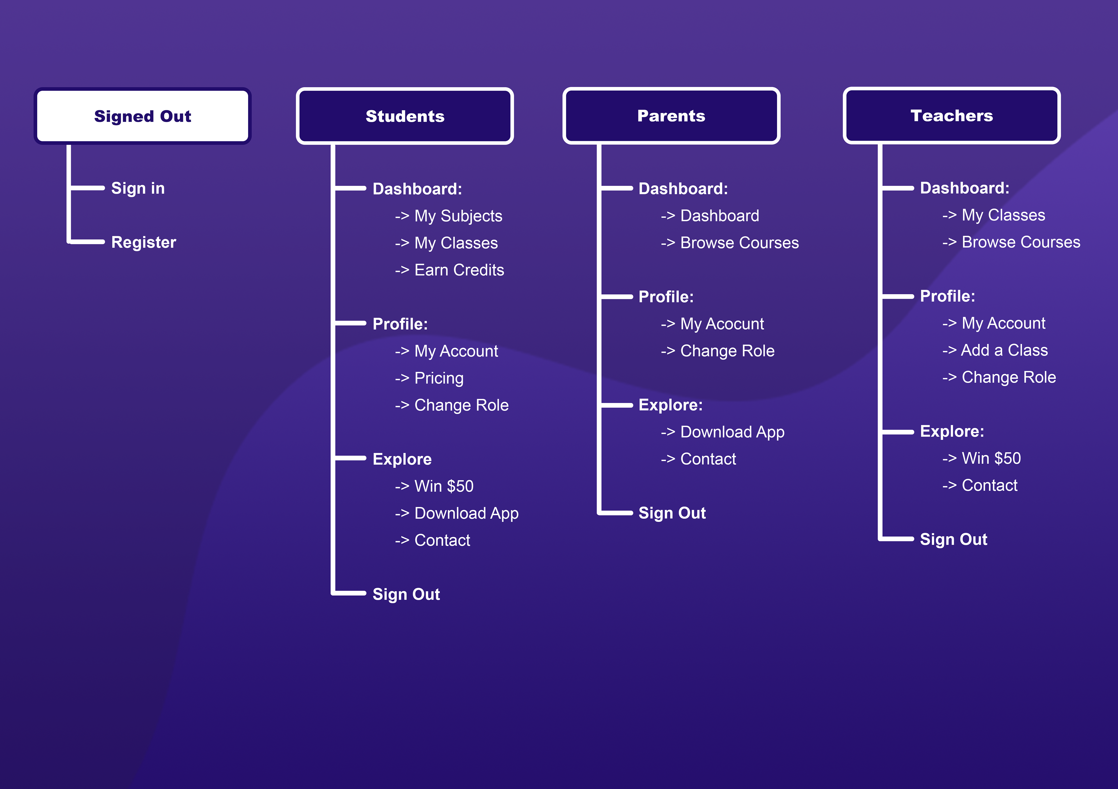
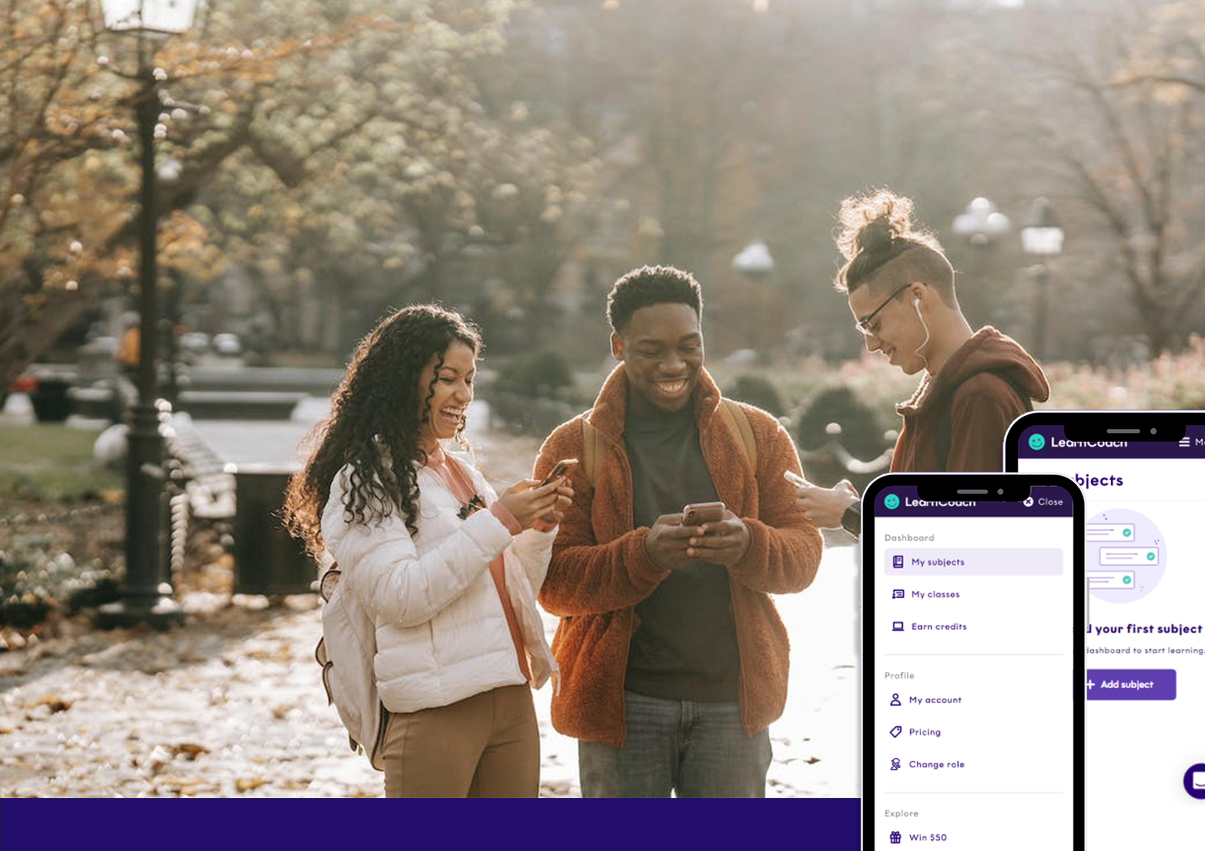
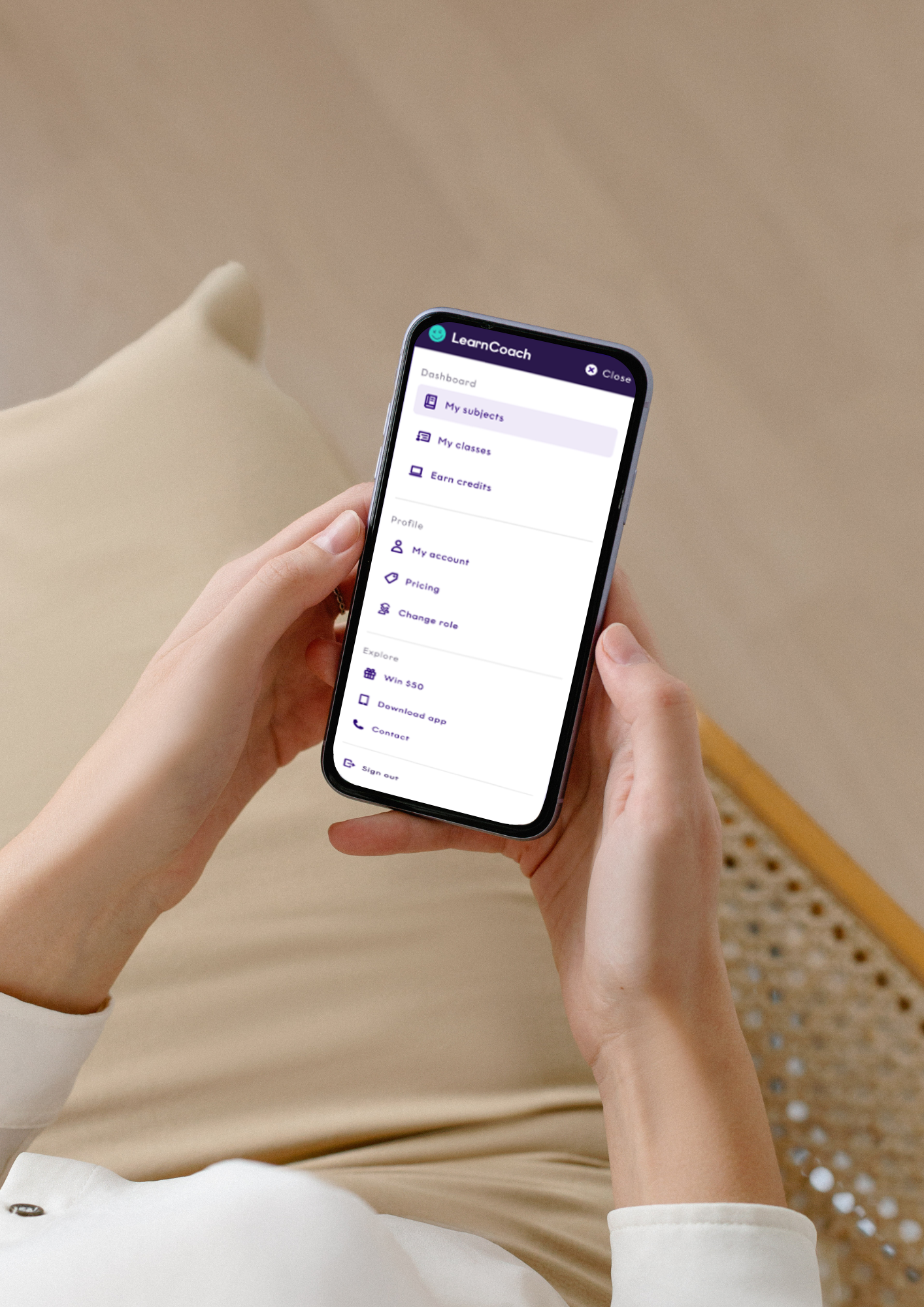
Based on insights from research and analysis, restructuring the navigation layout was the next priority. I created an information architecture, grouping related pages based on their relationship, which helped clarify how each page fit into its section. The final groupings were:
• Dashboard: Main content pages, like "My subjects."
• Profile: Personal settings, like "My account."
• Explore: Additional pages, like "Win $50."
• Sign out/Independent sections: Quick actions.
This structure set the foundation for wireframing and design mockups.
Creating the Designs (Wireframe and Mockups):
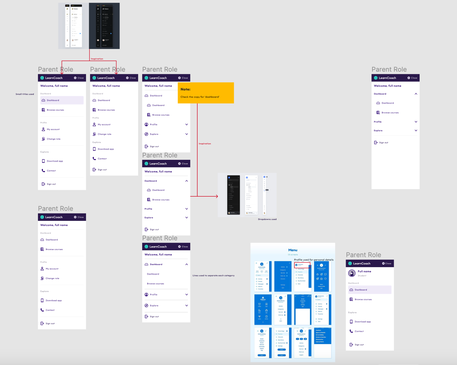
I unified the previous research and information architecture to create the new menu. I brainstormed and conceptualised the layout, experimenting with different groupings and iconography for each section. Design options I explored included:
• Dropdown chevrons
• Icons for section titles and individual pages
• Large section and page titles
• Profile icons
• Lines to separate sections
Throughout the process, I revisited research and the initial design to address pain points and ensure an intuitive experience, refining the final design through an iterative approach. I also collaborated with a junior designer to create consistent icons and worked closely with developers to identify and resolve any technical constraints.
Visual Cohesiveness:
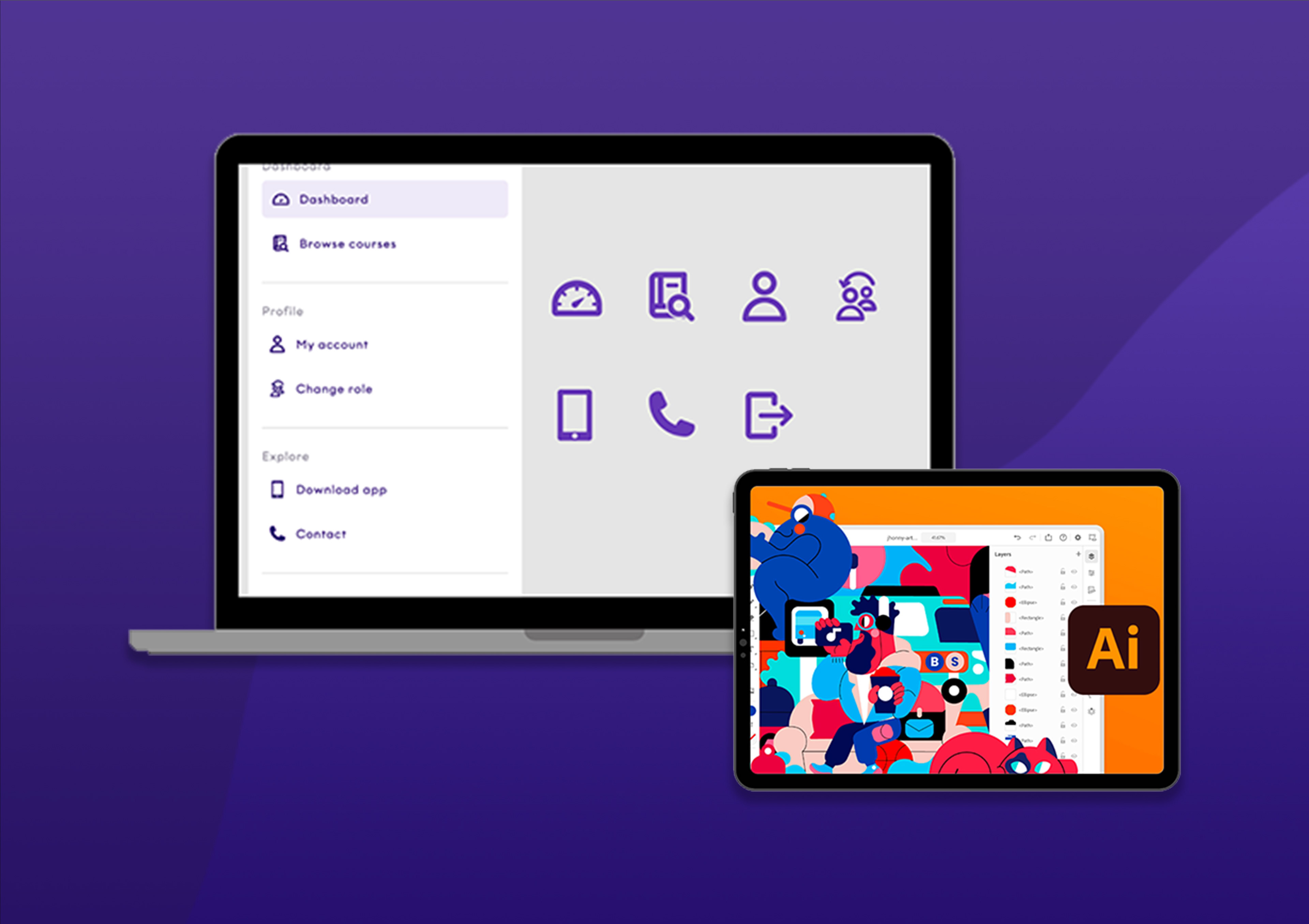
To maintain visual cohesiveness and support the brand, I worked with a colleague to redesign icons using consistent colours, radii, and line widths. We used Adobe Illustrator and conducted research to ensure the icons followed universal design patterns, reducing cognitive load and interaction costs.
By sticking to familiar iconography, we maintained usability and minimised user confusion.
The icons were designed within a consistent 24 x 24 px frame, using colours from the existing design system. Once the icons were finalised, the full navigation design was completed.
Conclusion:
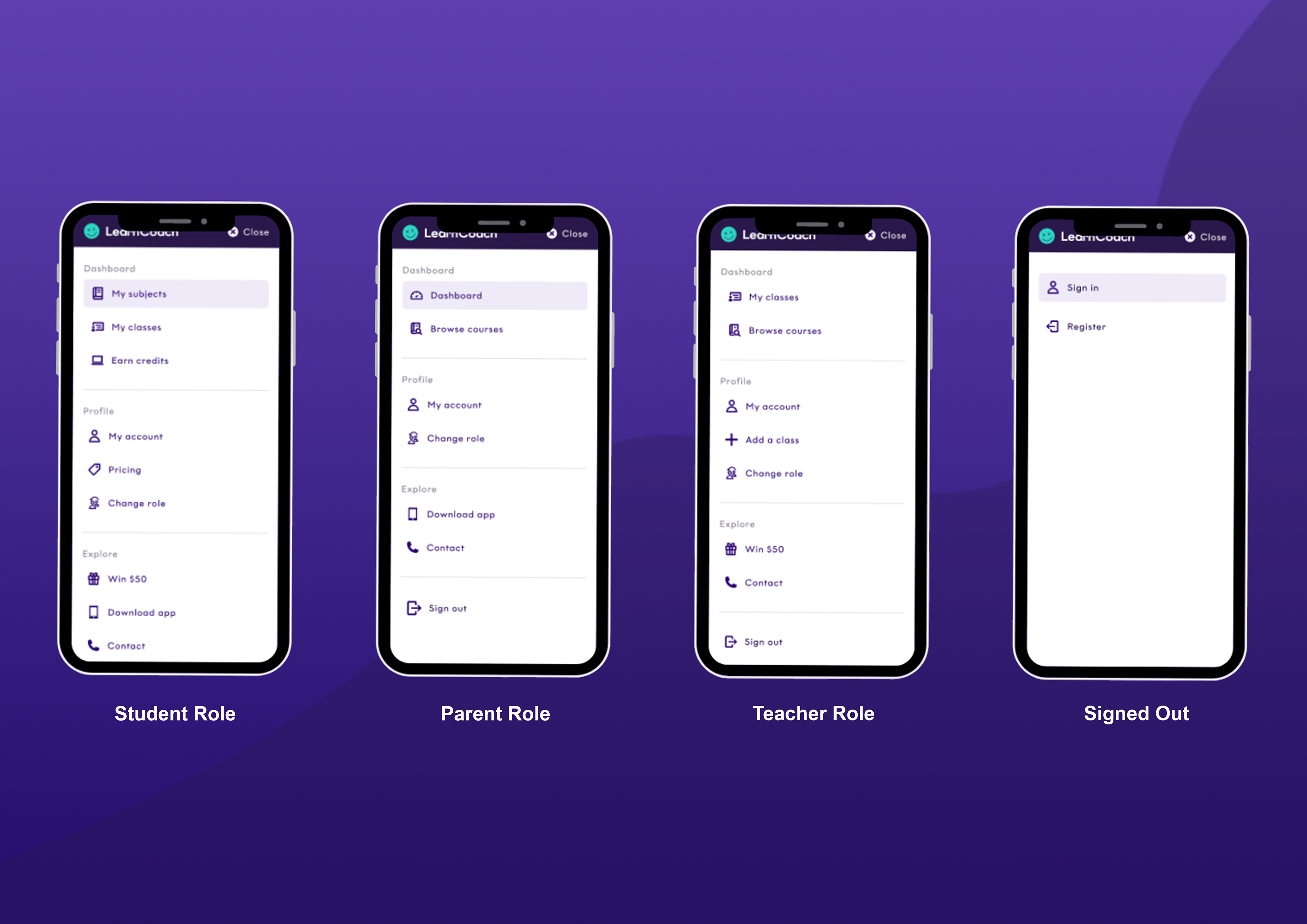
For the mobile menu redesign, I aimed to create a seamless, intuitive design that reduced interaction costs and cognitive load, enabling users to navigate efficiently.
By focusing on grouping and visual cohesiveness, I crafted a simple interface that enhanced the user experience. Drawing from research and analysis of the initial design, I ideated and created a solution that aligned with these goals.
Additionally, as my first lead project, I refined my cross-functional communication skills, addressing technical challenges and business concerns while receiving valuable mentorship from the senior designer.
Skills gained:
- UX/UI Design
- Leadership
- Product Design
- Copywriting
- QA
- Communication
- Ideating & Conceptualising